Basic Photo Composition
Photo composition is simply how and where the subject(s) or elements of a scene are positioned in a photo image. You have probably noticed that some photos just seem to be visually more pleasing than others. It is very likely that the composition of the photo is at least part of the reason for the difference.
There isn't a "one size fits all" method for composing photos. However, combining some of the following photography composition principles with your own creativity should produce some pretty good results.
There isn't a "one size fits all" method for composing photos. However, combining some of the following photography composition principles with your own creativity should produce some pretty good results.
Try Using the Rule of Thirds: Many beginner photographers will instinctively try to place the main subject of a photo in the dead center of the frame. That technique works well in many situations but the Rule of Thirds is a photo composition principle that can help you produce more balanced and visually pleasing images.
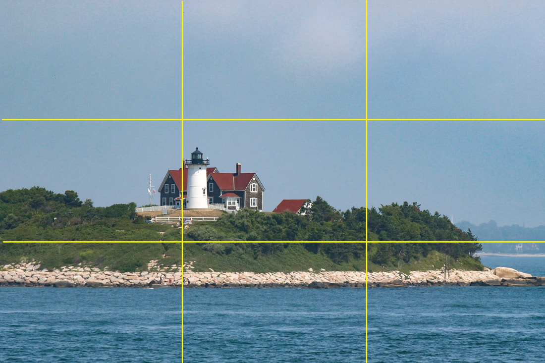
Image #1 Showing Rule of Thirds Gridlines
|
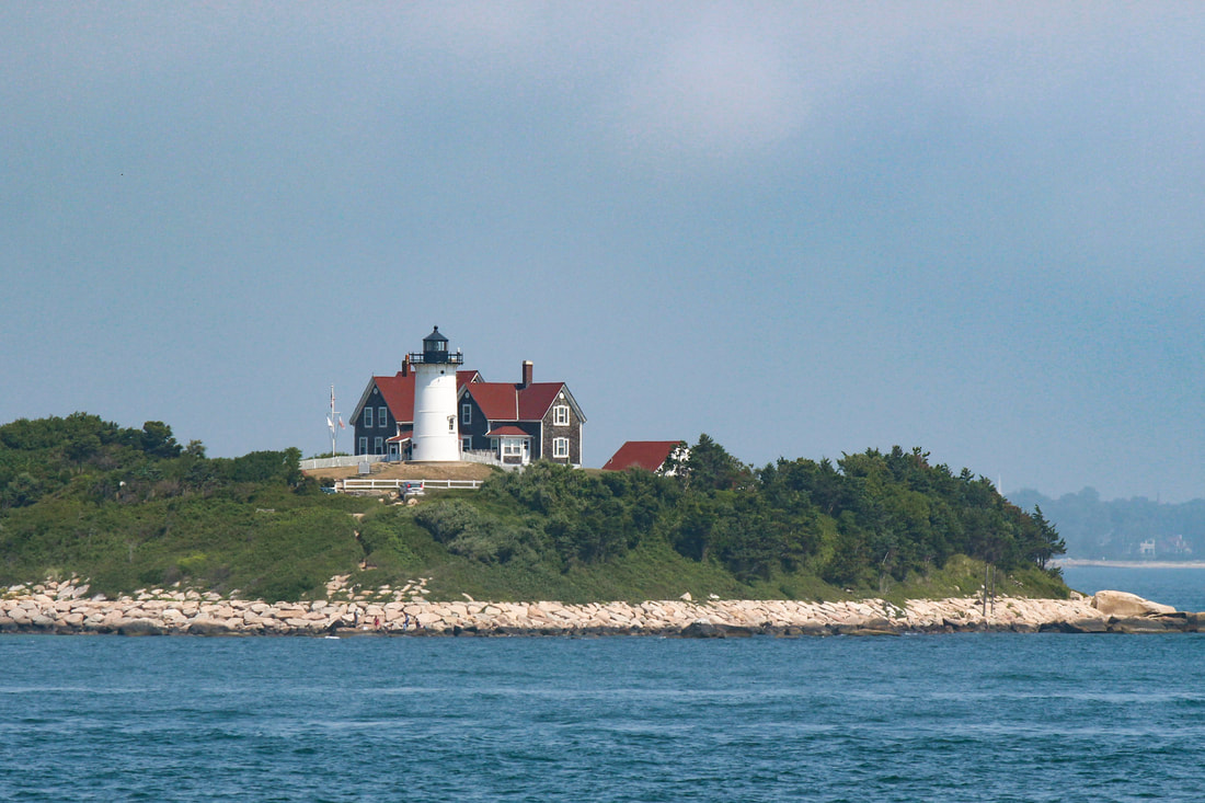
Image #1a, Rule of Thirds Image without Gridlines
|
The Rule of Thirds suggests that the primary subject and/or horizons should be placed slightly off center in the frame. This is accomplished by using gridlines to divide the scene into 3 equally spaced horizontal areas and 3 equally spaced vertical areas. Image #1 shows gridlines that divide the scene accordingly. The points where the vertical and horizontal lines intersect are called "Points of Interest"
Just about every digital camera will have settings that will show gridlines on your camera's LCD screen or in the viewfinder. You just have to find them in the menu. (gridlines are a guide and do not show in your final image)
When using the Rule of Thirds it is suggested that the primary subject should be placed near one of the points of interest rather than the exact center of the frame. The subject doesn't have to be placed exactly at the point of interest, just near it. When taking landscape or cityscape pictures, it is a good idea to place the horizon along or near the upper or lower horizontal grid line.
Take another look at image #1. The lighthouse is placed along the left side vertical line and close to 2 points of interest. The horizon is placed along the lower horizontal gridline. Image #1a is the same photo without the gridlines and it is a very nicely balanced picture.
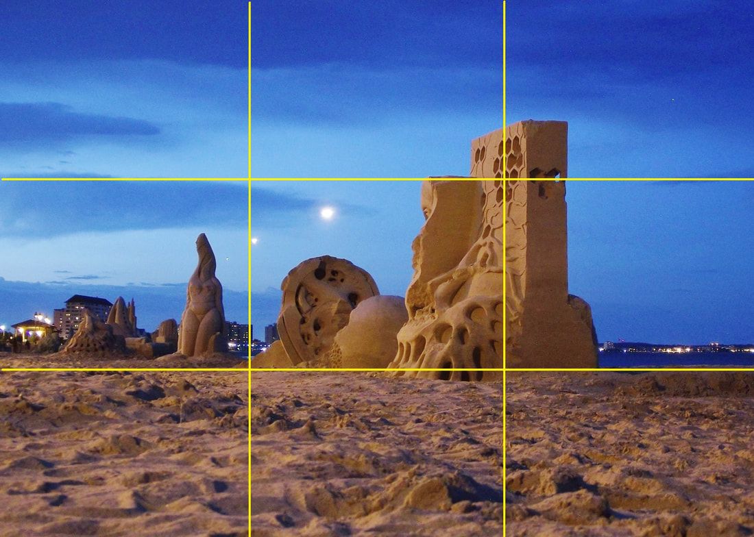
Image #2 Showing Rule of Thirds Gridlines
|
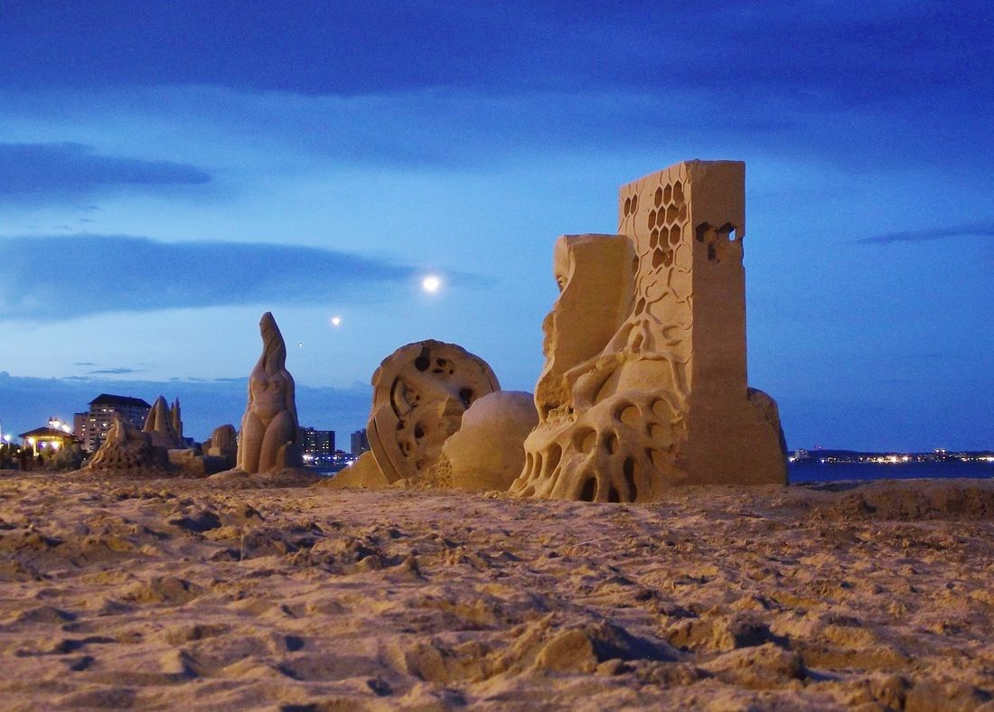
Image #2A, Rule of Thirds Image without Gridlines
|
The sand sculptures above are an unusual subject but the Rule of Thirds worked well in the image. Once again, the horizon is right around the lower horizontal gridline. (keep in mind that a horizon line can be placed around the upper horizontal grid line if there is interesting subject matter in the lower 2/3 of an image)
The largest sand sculpture in the photo falls on the right hand side vertical gridline and the smaller ones on the left of it balance the photo nicely.
Although the Rule of Thirds works well in many situations, it may not work for every scene or subject. For instance it usually won't work well for a close up portrait. The rule of thirds is a rule that could and should be broken at times.
If you feel that placing your subject in the center, or somewhere else in the frame would make a better picture, then by all means do it. However, don't forget that the rule of thirds is a tried and tested method that will help you produce quality, balanced images in many situations.
Try different viewpoints when composing photos: When composing a photo, try moving to different positions. Sometimes just moving a little to the left or right will give your picture a different look. For example, the composition of the photo of the statue below (Image #3) on the left is pretty plain and simple.
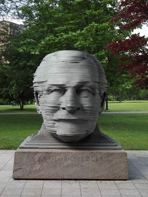
Photo Composition Image #3
|
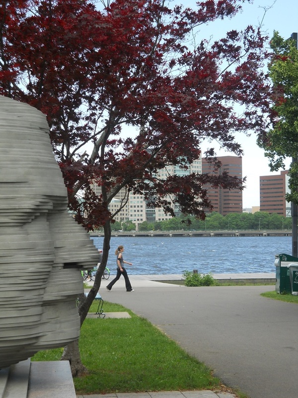
Photo Composition Image 3A
|
However, taking a picture of the same statue from the side and including less of the head,(Image #3A) creates a very different picture.
Zoom in or get closer: Another way to change the viewpoint of a scene or subject is to use your camera's zoom feature. If you take a picture from a wide angle view, and then zoom in to a telephoto view, you will have two totally different perspectives of the same scene or subject.
The standard minimum zoom of 5X to 6X found in most digital cameras will work well to change the overall look of a scene or subject as you zoom in or out.
For example, in image #4, the sky dominates the picture. That is not a problem if the subject of the picture is the huge clouds in the sky at sunset. However, if the main subject of the picture is the gentleman, then image #4A on the right is more effective for a portrait type image.

Photo Composition Image #4
|

Photo Composition #4A
|
It is clear see that by moving closer or by zooming in, the gentleman has become the main focus of the picture instead of the sky. Also notice that by holding the camera in the vertical position, it is easier to fill the frame with the subject.
Using the camera in the vertical position will also work well for a great deal of other photography subjects. You should practice looking at a scene or subject before taking your picture and then determine if using the camera in the horizontal or vertical position would work best.
Using the camera in the vertical position will also work well for a great deal of other photography subjects. You should practice looking at a scene or subject before taking your picture and then determine if using the camera in the horizontal or vertical position would work best.
Experiment With Negative Space Photography: Negative space in an image is the area around or surrounding the main subject. The area in the image that the primary subject occupies is called Positive space. Contrary to what was previously mentioned about getting closer and filling up the frame with the subject, negative space images work best when the subject occupies at least less than 1/2 of the total image area. Sometimes, the smaller the subject the better.
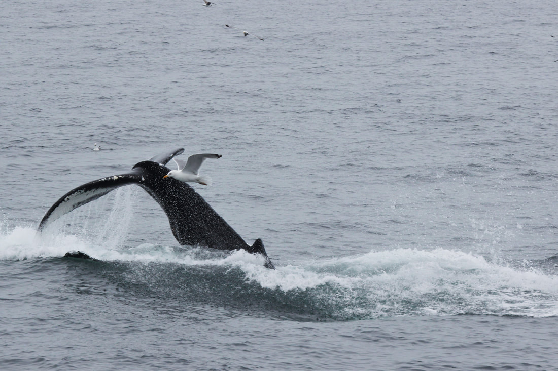
Photo Composition Image #5
|

Photo Composition Image #6
|
The theory behind negative space images is that the the human eye will review the entire image (including the negative space) but will keep being drawn to the main subject. (the positive space) When used properly, the negative space area should not be too busy or distracting so that it does not draw attention away from the positive space subject.
Image #5 shows a whale diving with only his tailfin above the water. There is also a seagull very close to the tail probably looking for scraps of what the whale is feeding on. The negative space water takes up most of the frame in the image but our eyes are drawn to the whale and the seagull.
Image #5 shows a whale diving with only his tailfin above the water. There is also a seagull very close to the tail probably looking for scraps of what the whale is feeding on. The negative space water takes up most of the frame in the image but our eyes are drawn to the whale and the seagull.
In image #6 the negative space is the sky and the snow on the ground. Even though the sky and snow take up most of the space in the frame, the viewers eyes are drawn back to the positive space solitary tree.
The sky, water, beaches, grass or blank walls are the easiest backgrounds to use when creating a negative space image. However, it is possible to create nice negative space images using other backgrounds. For more about negative space photography and to see more examples, visit Negative Space Photography
The sky, water, beaches, grass or blank walls are the easiest backgrounds to use when creating a negative space image. However, it is possible to create nice negative space images using other backgrounds. For more about negative space photography and to see more examples, visit Negative Space Photography
Compose Photos Using Leading Lines and Patterns: Using leading lines when composing photos is a very effective photography technique because it has the effect of leading the viewers eyes through the image to a certain point or to infinity. Leading lines are effective in photo composition whether the lines are horizontal, vertical or curved.
For example, the curve and the lights on the shoreline in image #7 are a good example of how leading lines can lead the viewers eye through just about the whole picture.
For example, the curve and the lights on the shoreline in image #7 are a good example of how leading lines can lead the viewers eye through just about the whole picture.
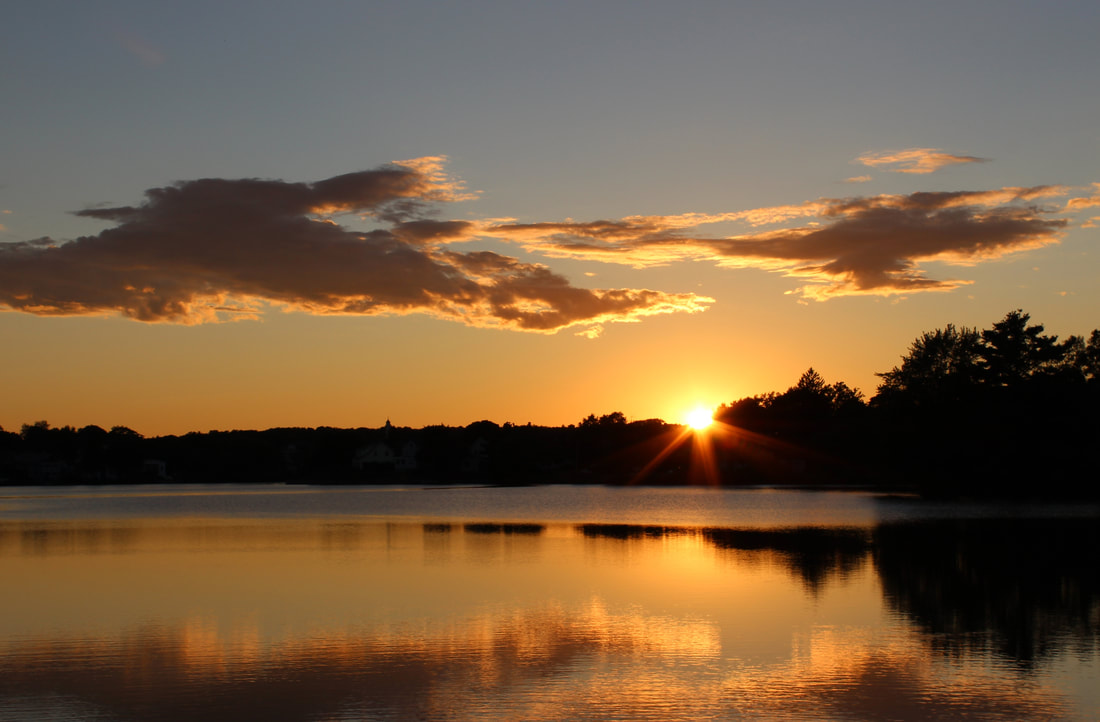
Photo Composition Image #7-Leading Lines
|
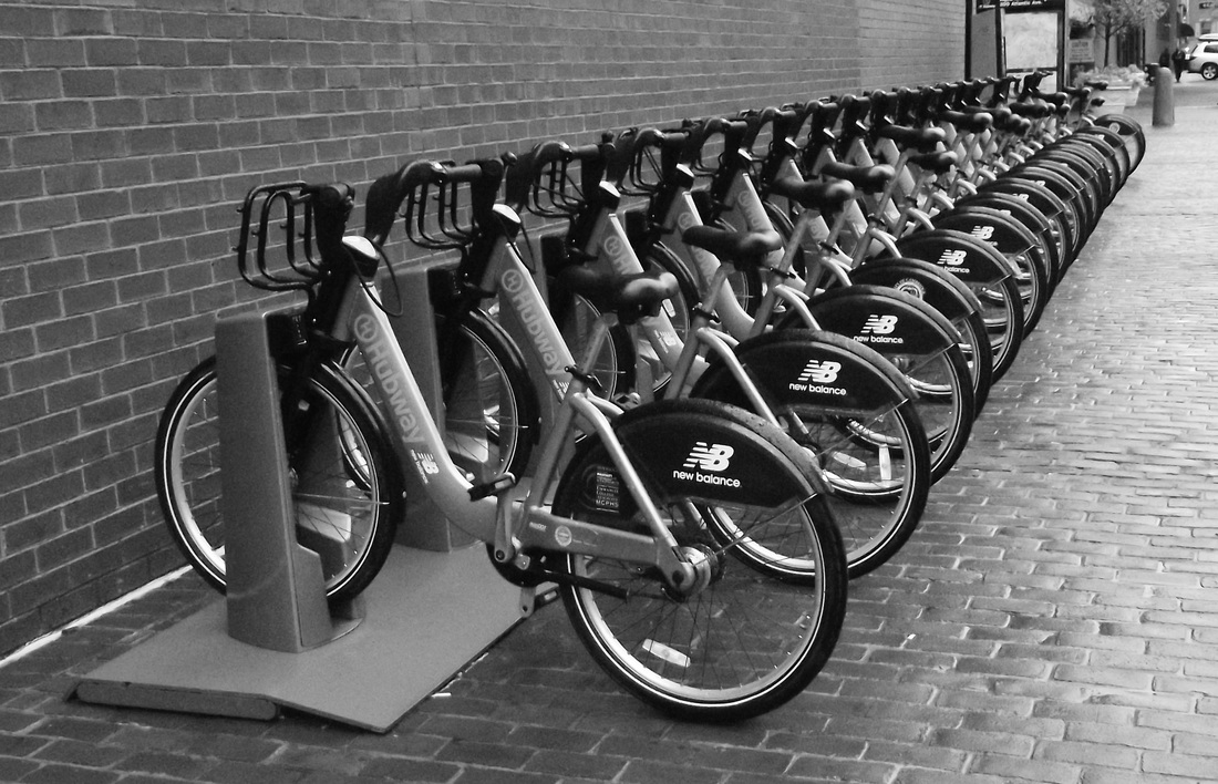
Photo Composition Image #8-Pattern With Leading Lines
|
The bicycles on the rack in image #8 create a repeating pattern that attracts the viewers attention. The bicycles in this image also give the "effect" of converging leading lines which leads the viewers eyes through the entire image. The bicycle wheels are obviously round and you can see that you don't always need actual "lines" in your image for a leading line effect.
Not every scene or subject will lend itself to this photography composition technique, but be on the lookout for leading lines and patterns that you can use in your own artistic way when the occasion arises.
Not every scene or subject will lend itself to this photography composition technique, but be on the lookout for leading lines and patterns that you can use in your own artistic way when the occasion arises.
Use a frame: Using doorways, trees, and windows to make a frame or partial frame around your subject is another widely used technique for composing photos. This is a pleasing effect that helps to draw the viewers eye to a particular area in your image. Images #9 and 10 are examples.
Photo Composition Image #9-Framing the Subject
|

Photo Composition Image #10-Framing the subject
|
Look before you shoot: "Seeing" what you are photographing before taking the shot is another key to better photography composition. That means paying attention to everything visible in the camera's viewfinder or LCD screen before you press the shutter release button. Ask yourself: Is there anything distracting that is taking the focus away from your main subject?. Many surprises can be avoided in your final image when composing a photo just by taking a closer look.
Leave room for movement: If there is subject movement or something in your photo that leads the viewers eyes in a particular direction, make sure to leave room in the frame for that motion to continue.
For instance, the runner in the image #11 below doesn't appear to have much room to continue. However, there is more space in front of the runner in the picture #11A, so you don't get the feeling that she has run out of room.
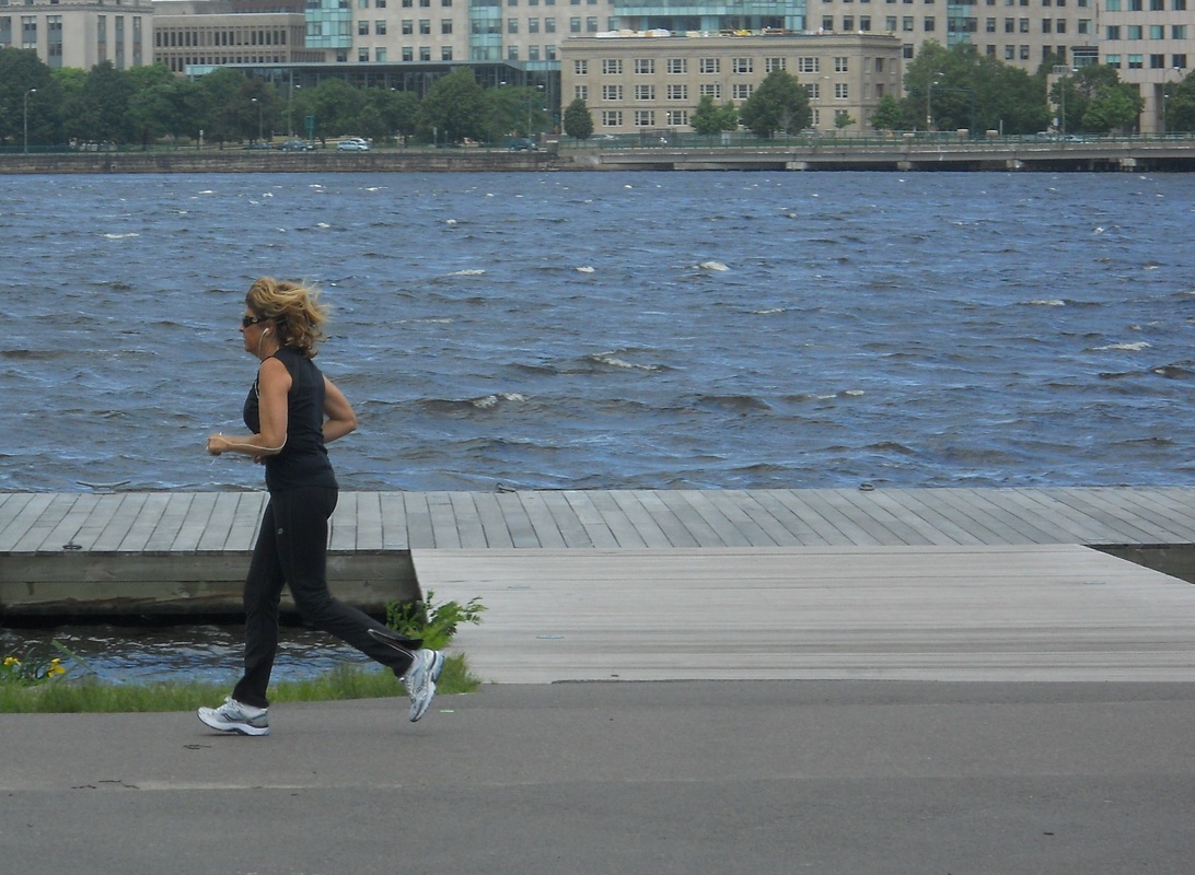
Photo Composition Image #11-Not Enough Room to Continue Movement
|

Photo Composition Image #11A-More Room For Movement to Continue
|
As mentioned at the beginning of this article, there is no absolute set way a picture should be composed. However if you use some of the photo composition techniques from this tutorial as a starting point, your creative juices will take you the rest of the way.
Now that you understand some of the basics of photo composition, check the Camera Exposure Basics tutorial for tips on setting your camera for the best exposures.
Now that you understand some of the basics of photo composition, check the Camera Exposure Basics tutorial for tips on setting your camera for the best exposures.